CSS Generator
Flexbox buildwithreact
Flexbox, or the Flexible Box Layout, is a tool available in CSS that provides advanced
layout management for components on a webpage. It is a way to arrange elements within a container so that they maintain proper proportions and adapt to various screen sizes and devices.
Main Features and Applications of Flexbox:
-
Alignment of Elements: Flexbox allows for easy alignment of items both horizontally and vertically within a container, without relying on complex floats or positioning systems.
-
Size Adaptation: Items within a flex container can automatically adjust their size, both in relation to one another and to the container they're housed in.
-
Direction and Order: Through properties like
flex-directionandorder, one can easily control the layout and sequence of items within the container. -
Flexibility: Flexbox offers control over the "flexibility" of items, defining how they can stretch and shrink depending on available space.
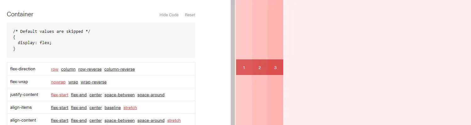
Interactive Reference Tool:
Utilizing an interactive Flexbox reference tool allows for practical understanding and experimentation with various properties and layouts. With it, even those unfamiliar with this layout system can quickly learn its basics and see the effects of their changes live. It is particularly valuable for developers and designers looking to master this powerful technology, enhancing efficiency and quality in their web design projects.
With visual guides, live previews, and a range of examples, an interactive Flexbox reference tool can be a go-to resource for both beginners and experienced developers wanting to get the most out of this layout model. It makes complex layouts more accessible and paves the way for responsive and adaptable design, a crucial aspect of modern web development.