CSS Generator
Optimal Responsive Image Dimensions: A Guide to Calculating Breakpoints Automatically
One of the major hurdles in responsive web design is selecting the optimal responsive image dimensions.
Given the multitude of devices and screen resolutions, using one image for all just doesn't cut it. But generating an image for every single pixel is overkill. So, how can you strike a balance? The answer lies in calculating image breakpoints in a more systematic way.
Responsive websites, even the cutting-edge ones, often grapple with finding image resolutions that are tailored to various user devices. The common dilemma is either compromising on the image dimensions or the number of images. This article aims to provide a solution for these challenges.
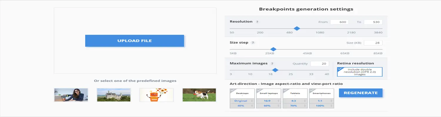
Responsive web design mandates that developers nail down the image dimensions that suit their website the best. Our breakpoints generator tool is a boon for developers, aiding them in automatically ascertaining the optimal image sizes for the best viewing experience on both web and mobile apps across diverse screen sizes.
Many existing responsive image solutions generate images based on a fixed set of image width values, ignoring the real-world savings in file size bytes. That's where our breakthrough comes in. Powered by Cloudinary's advanced algorithms, our breakpoint generator tool efficiently pinpoints the most suitable breakpoints for each uploaded image.
The principle behind this is algorithmic. The tool identifies image width values that result in a substantial reduction in file size. Each image is scrutinized to determine the best breakpoints on an individual basis, as opposed to generating all conceivable image resolutions. This enables developers to effortlessly construct 'picture' and 'img' HTML5 elements using the computed breakpoints.